Client
Functional Mother
the challenge
Functional Mother was a brand-new business in need of a full identity. Their original logo lacked the sophistication and personality needed to carry the brand forward, and they also needed a complete visual system and website to connect with their audience.
THE solution
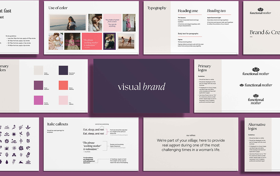
The logo was redesigned to feel feminine, elegant, genuine, and trustworthy. At the client’s request to keep the imagery of hands and a lotus flower—symbols of support and transformation—the two elements were combined into one mark.
Typography is a central focus, pairing the brand’s serif and italic typefaces to elevate text-heavy, educational messaging. Imperfect, organic floral illustrations, authentic photography, and candid language are used to connect to real life, and it’s paired with a delicate and feminine palette, accented by bright pinks for impact and personality. Together, the system creates a brand and website that feel real and emotional—just like their clients.
The concepts shown include select exploratory extensions created to further demonstrate the brand’s potential across touchpoints.