Client
Grato Creative

the challenge
Grato Creative needed a brand that properly reflects who they are as designers and what they’re all about. Their starting point was a simple typographic logo with a familiar squiggle accent and a one-pager website showing some of their work.
the solution
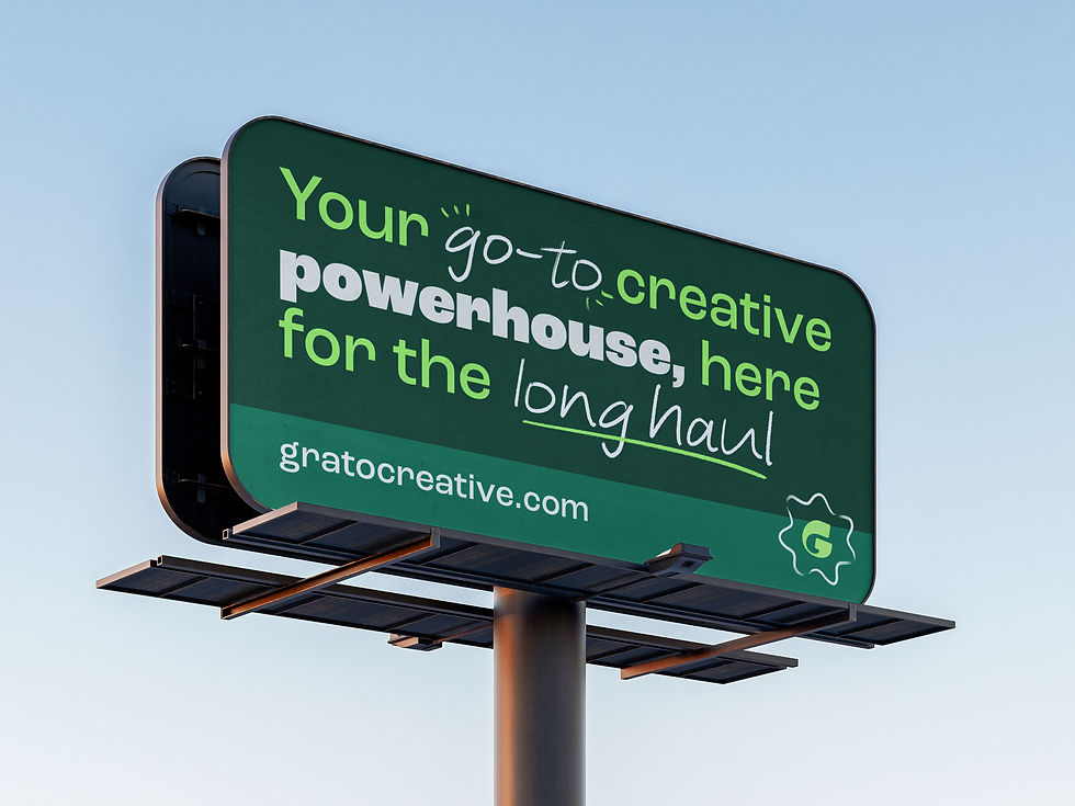
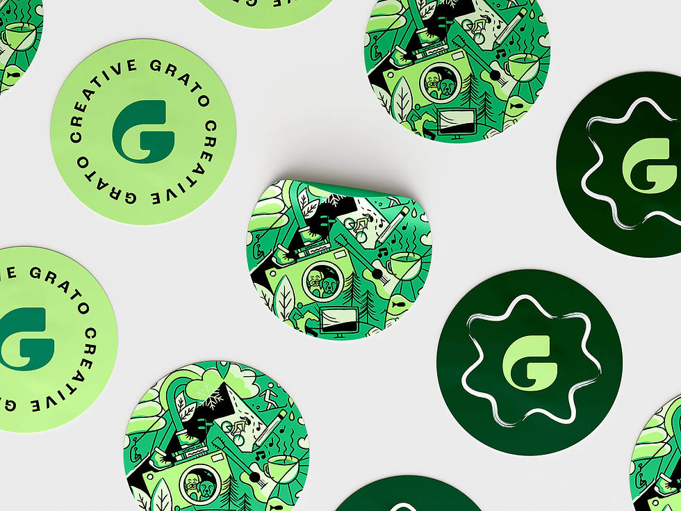
Jaclyn partnered with the Grato founders to create a visual identity as creative and quirky as they are. The final brand combines solid typography and blocks of color—representing strategy, function, and reason—with sketchy, hand-drawn accents and illustrations that capture the creative process itself: exploring, editing, and refining.
The logo is made of custom letterforms that are playful and unexpected, but also anchored in a solid, balanced structure, completing the visual identity. Jaclyn refined Grato's original squiggle as nod to its formative years. A bold palette ties it all together, giving the brand a confident, vibrant presence that’s expressive, approachable, and unmistakably creative.