Client
ICON International
the challenge
ICON International is one of the most established firms in their industry, but their visual presence didn't reflect it. Their starting point was a logo they wanted to keep for familiarity, with no color palette, typography system, or visual language to carry the brand across the many touchpoints a global finance company needs.
the solution
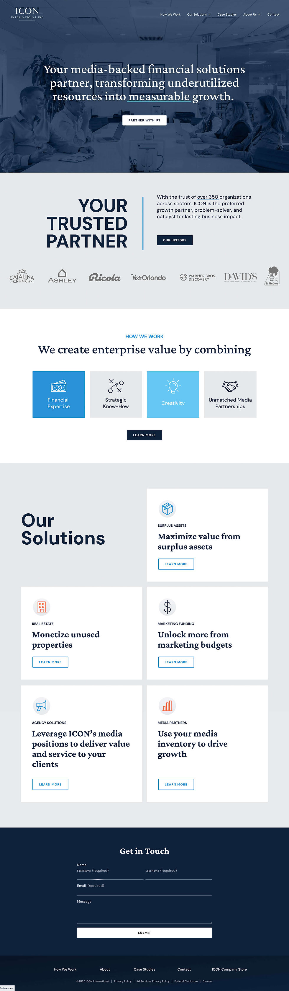
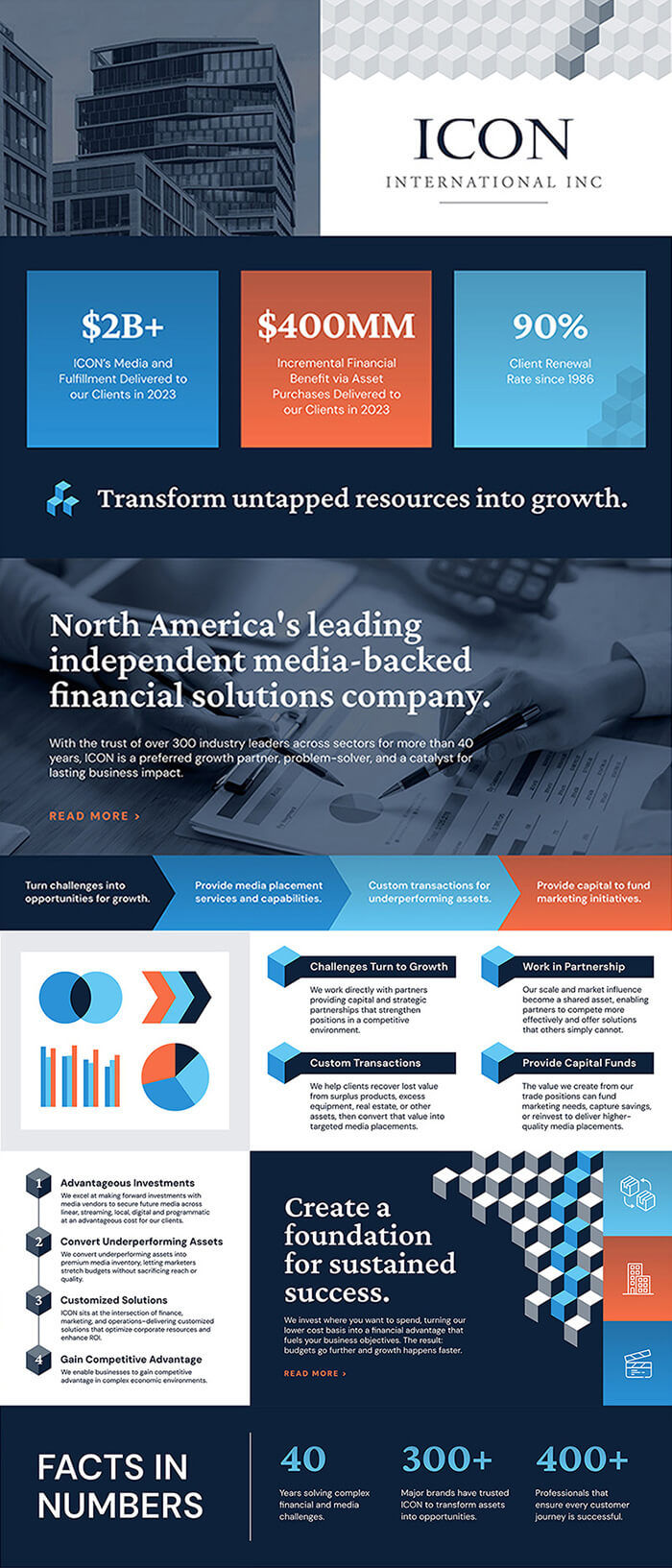
Jaclyn partnered with ICON's leadership and team leads to build a full visual identity around their existing logo. The color palette anchors the brand in navy and gray for a formal, timeless tone. A 3D block graphic acts as the brand's signature element, buildable into groupings and patterns that symbolize the foundational support ICON provides their clients. Varied typography combinations, pops of color, and graphic elements make text-heavy content visually intriguing, while refined and orderly layouts balance personality with the structure of a reputable financial institution.
The system extends across a comprehensive style guide, website redesign, 50+ slide PowerPoint templates, newsletters, 20+ social media post templates, graphics, stationery, executive summaries, custom iconography, and a special 40th anniversary logo and merchandise. Together, these pieces give ICON a brand presence that finally matches the substance of the business behind it.


.jpg)
.jpg)

.jpg)

.jpg)
.jpg)
.jpg)
.jpg)
.jpg)
.jpg)
.jpg)
.jpg)
.jpg)